Numerical data

Visualization and summary statistics (part 2)

2025-09-17

Announcements

  • None!

Interpreting SD

We learned about the sample mean \(\bar{x}\), the sample variance \(s^2 = \frac{1}{n-1} \sum_{i=1}^{n} (x_{i} - \bar{x})^2\), and the sample standard deviation \(s = \sqrt{s^2}\)

  • Why care about standard deviation (SD)? Describes how far data are distributed from their mean

  • Usually (but not always!!) about 70% of the data will be within one SD of the mean, and 95% will be within two SDs

    • These percentages are not precise, but are useful for intuition

    • We will come back to this later in semester

Visualizing SD

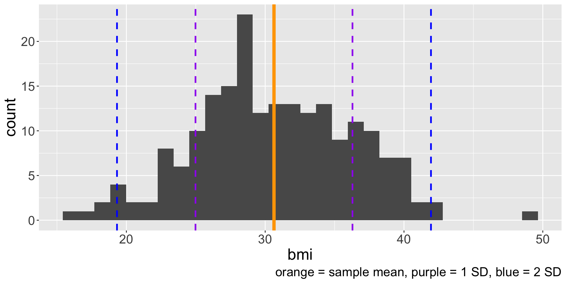
Visualizing SD (cont.)

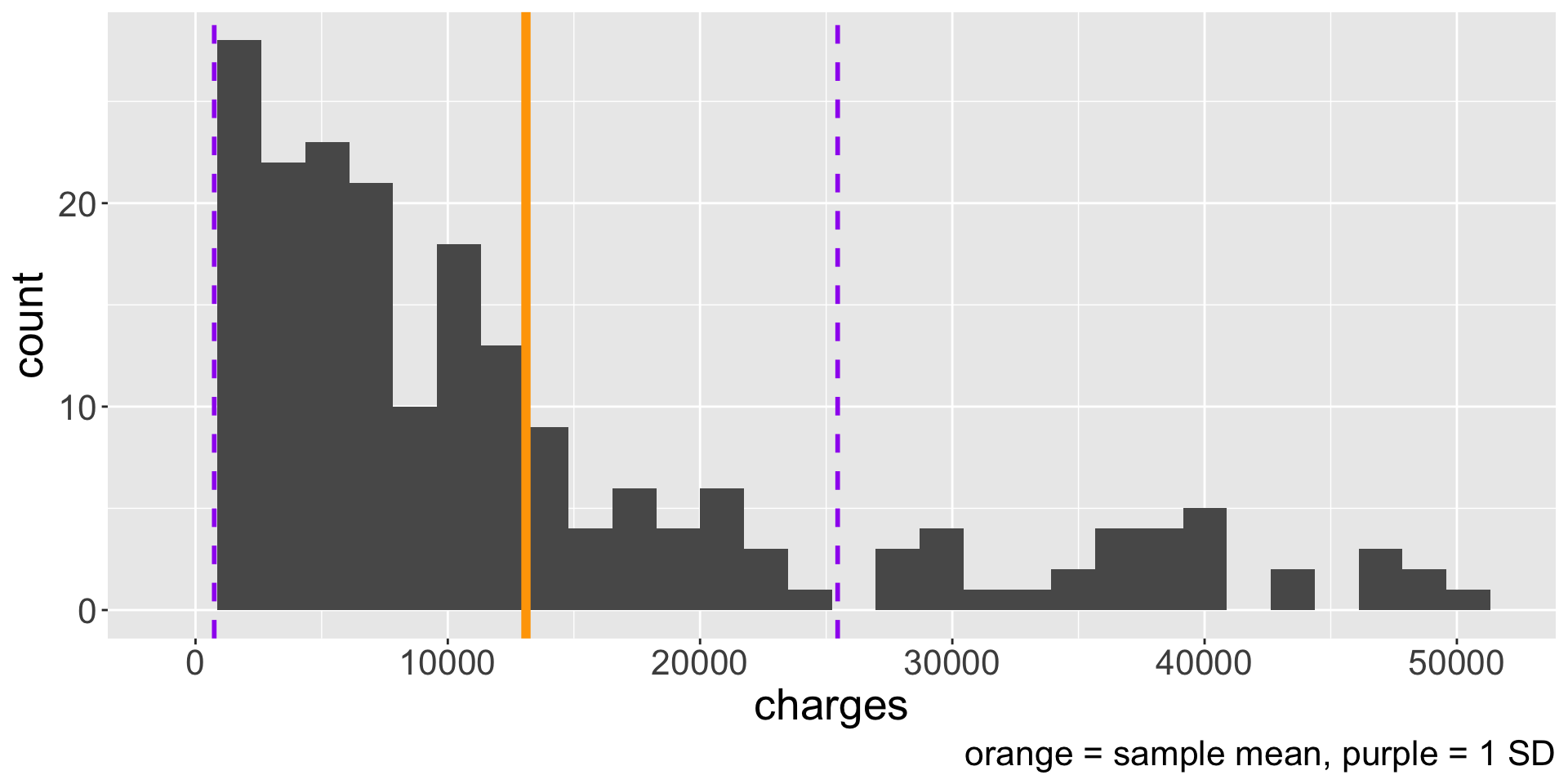
We know how to calculate some summary statistics and interpret them alongside the histogram. But wouldn’t it be great if we had a visualization that directly displays some summary statistics?

Boxplot

Another commonly used visualization to display the distribution of a numerical variable is the boxplot. Boxplots are created using five statistics and identify unusual observations.

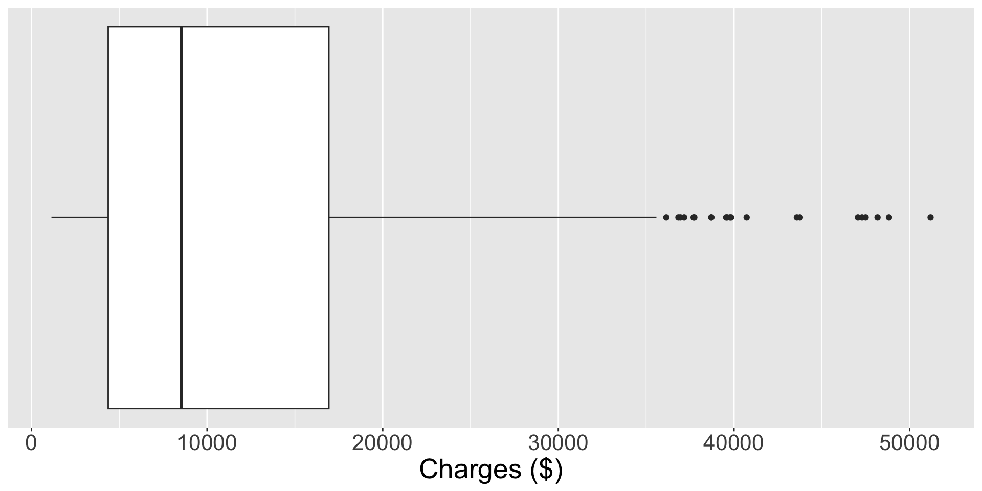
  • Does the orientation (vertical or horizontal) matter?

Median

  • The (sample) median \(m\) is another common measure of center of a distribution. It is the value of the data distribution where 50% of the data are less than \(m\) and 50% of the data are greater than \(m\).

    • If we order the data from smallest to largest, the median is the value in the middle.
    • If the number of observations \(n\) is even, then there will be two values in the middle, and the median is taken as their average
  • Consider the following data: \(\boldsymbol{x} =108,112,113, 114, 115, 116, 118, 119, 121, 129\). What is the median?

  • The median is also known the 50th percentile because 50% of the data fall below \(m\)

  • Code in R: median(x) where \(x\) is a vector

Quartiles

  • The 25th percentile is the value of data with 25% of values below it. Special name: first quartile \(Q_{1}\)

  • The 75th percentile is the value of data with 75% of values below it. Special name: third quartile \(Q_{3}\)

  • What percent of the data fall between \(Q_{1}\) and \(Q_{3}\)? What percent of the data fall between \(Q_{1}\) and the median?

  • How to calculate? Suppose we have \(2q\) (even) or \(2q + 1\) (odd) number of values

    • \(Q_{1}\) is the median of the \(q\) smallest values

    • \(Q_{3}\) is the median of the \(q\) largest values

  • What are \(Q_{1}\) and \(Q_{3}\) of the data \(\boldsymbol{x} = 108,112,113, 114, 115, 116, 118, 119, 121, 129\)?

Interquartile range

The interquartile range (IQR) is another measure of variability/spread in the data.

\[ IQR = Q_{3} - Q_{1} \]

  • If the data are more spread out data, should the IQR increase or decrease?
  • What is the IQR of the data \(\boldsymbol{x}\)?

Creating the boxplot

  • The “box” part of the boxplot is created using \(Q_{1}\), \(m\), and \(Q_{3}\)

  • Draw whiskers from the box that attempt to capture data outside the IQR

    • How long should the whiskers be? There isn’t a fixed rule, but \(1.5 \times IQR\) below \(Q_1\) and above \(Q_{3}\) is common
    • We “cut off” the whiskers at one of the observed values
      • e.g. we draw out the right whisker to greatest data point that is less than or equal to \(Q_{3} + 1.5\times IQR\)
  • Lastly, we add dots for any cases that lie beyond the whiskers

    • These points are unusually high/low compared to the rest of the data and are worth identifying as potential outliers

    • An outlier is an observation that appears extreme relative to the rest of the data

  • Let’s draw a boxplot for the data \(\boldsymbol{x}\)!

A note on outliers

  • Why are we interested in identifying outliers?

    • Identifying strong skew

    • Identifying possible data collection/data entry errors

    • Providing insight into interesting properties of the data

  • Are outliers necessarily indicative of a problem in the data?

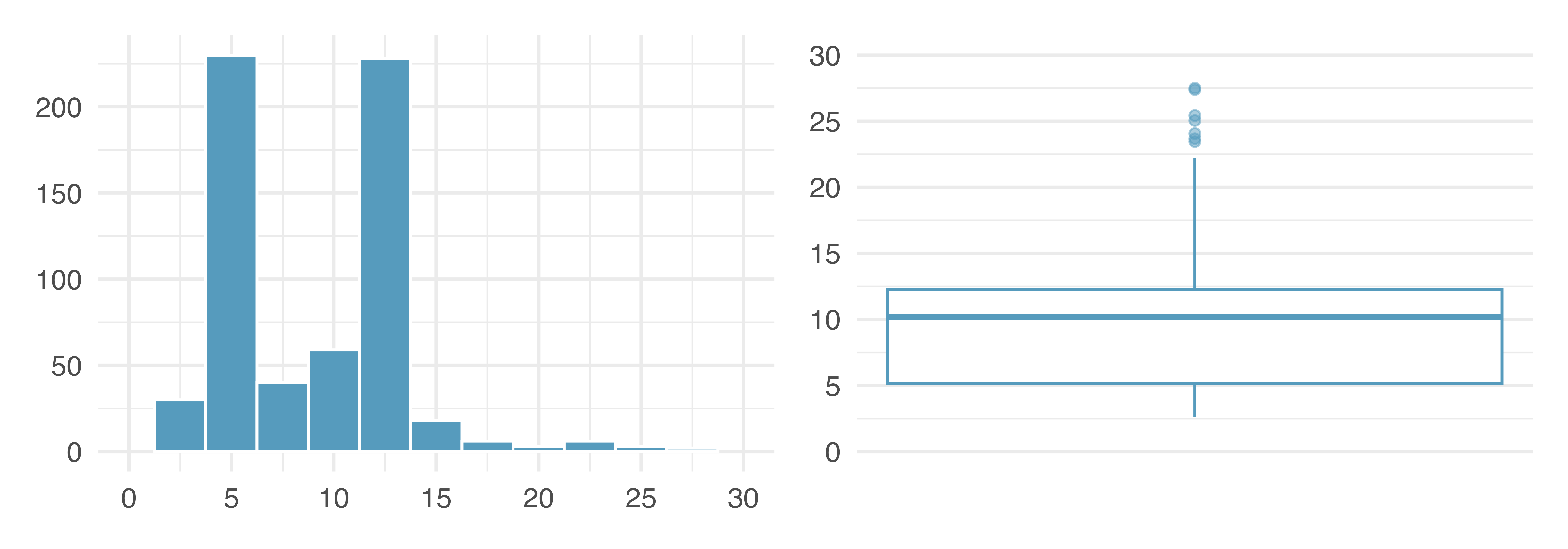
Histograms vs boxplots

What characteristics of the distribution are apparent in the histogram and not in the box plot? What characteristics are apparent in the box plot but not in the histogram?

Robust statistics

  • In the data \(\boldsymbol{x} = 108,112,113, 114, 115, 116, 118, 119, 121, 129\) that we have been working with, we have the following sample statistics:

\(\qquad \bar{x} =\) 116.5, \(s =\) 5.8, \(m =\) 115.5 , \(IQR =\) 6

  • Suppose we actually observed an additional data point with a value of \(170\). What are the sample statistics with this additional data point? How do they compare to the values above?

    \(\bar{x}' =\) 121.4, \(s' =\) 17.03, \(m' =\) _____, \(IQR' =\) _____

  • Robust statistics are statistics that are minimally affected by extreme values

    • Which of the statistics above would be considered robust?
  • When should the mean be similar to the median (and the standard deviation similar to the IQR)?

Mean vs. Median

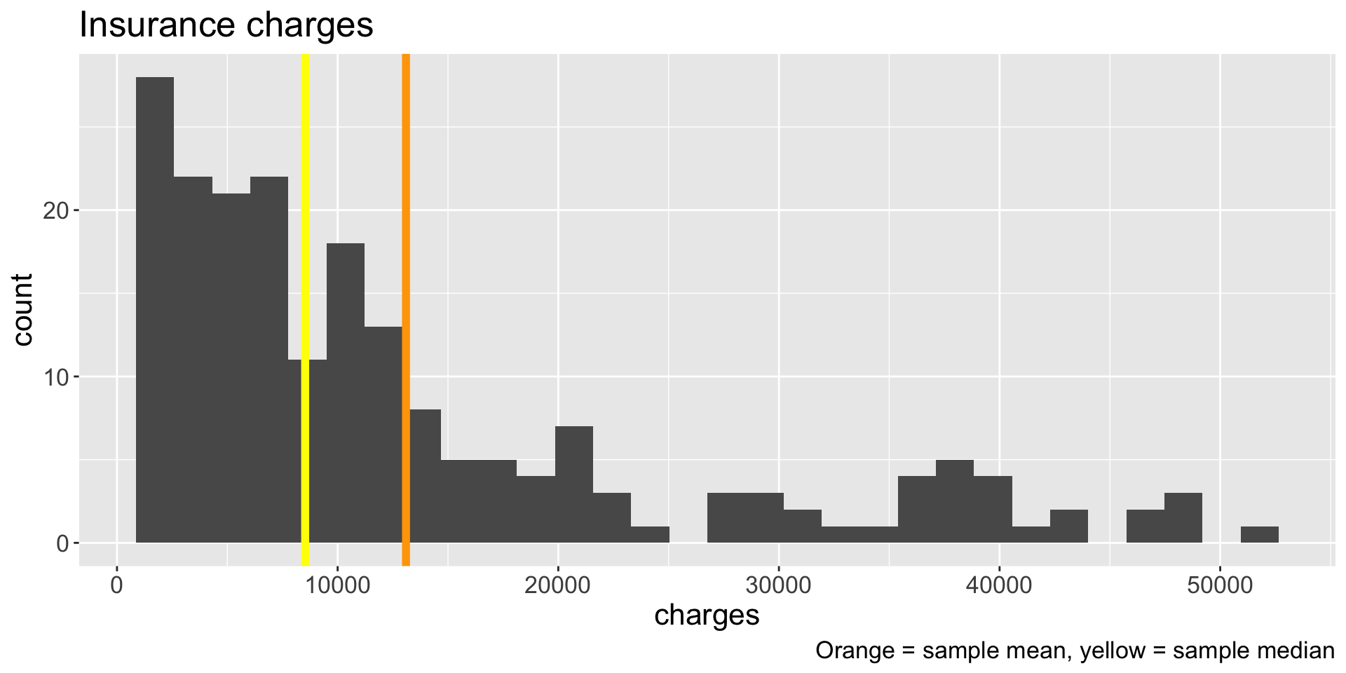
Which is better measure of center? The mean or the median?

Summary

  • Boxplots are another univariate visualization for numerical data

  • Median and IQR are robust to outliers, whereas mean and standard deviation are sensitive to outliers

  • When should we prefer median over mean (or vice versa)?