Housekeeping
- Problem set 2 due tonight! Please be sure to submit both written and rendered parts by combining into a single PDF
- Problem set 1 graded
Categorical data
Recall that a variable is either numerical or categorical
Categorical variables are variables that can take one of a limited (usually fixed) number of possible values, known as levels
- Represent data that can be divided into groups
Two types:
Example:
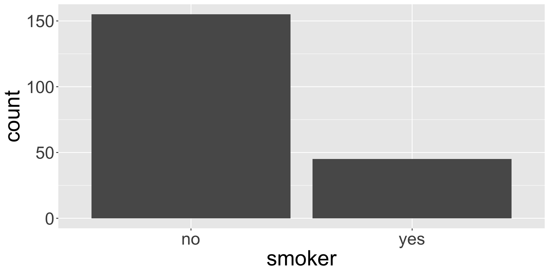
Univariate EDA
If we are interested in understanding the distribution of a single categorical variable, it is common to:
Display a frequency table, which is a table of counts of each level
# A tibble: 2 × 2
  smoker     n
  <chr>  <int>
1 no       155
2 yes       45
Create a bar plot, where different levels are displayed on one axis and the counts are portrayed on the other
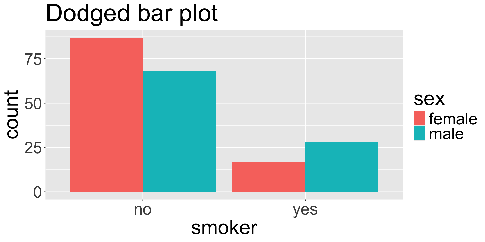
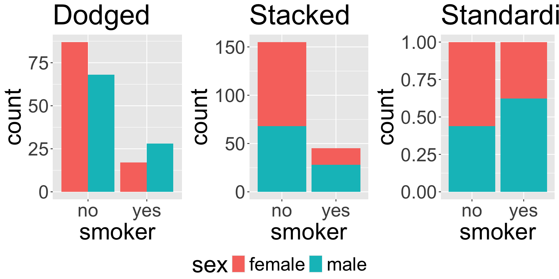
Dodged bar plot
The dodged bar plot directly converts the contingency table to a visualization.
Contingency table
| no |
87 |
68 |
| yes |
17 |
28 |
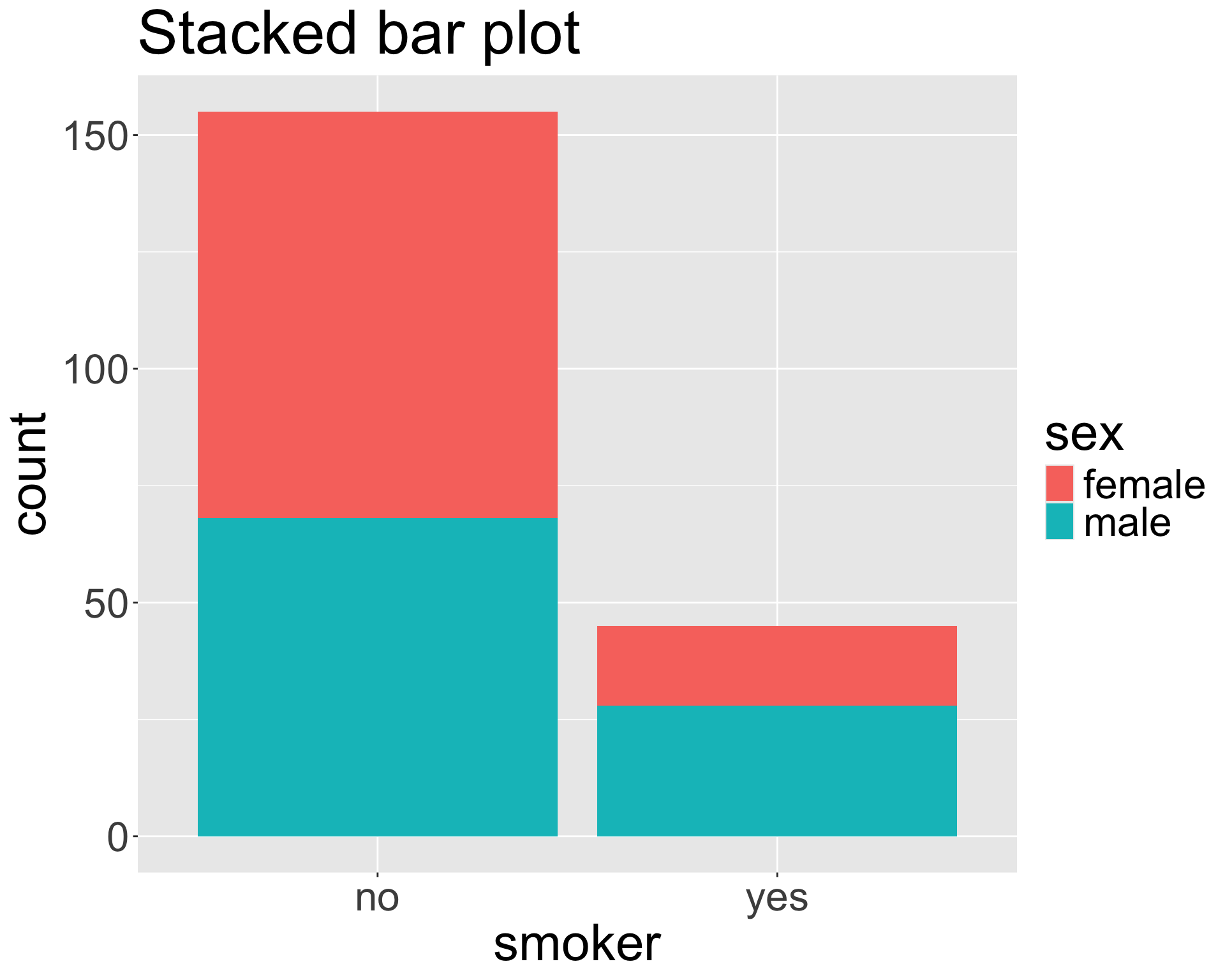
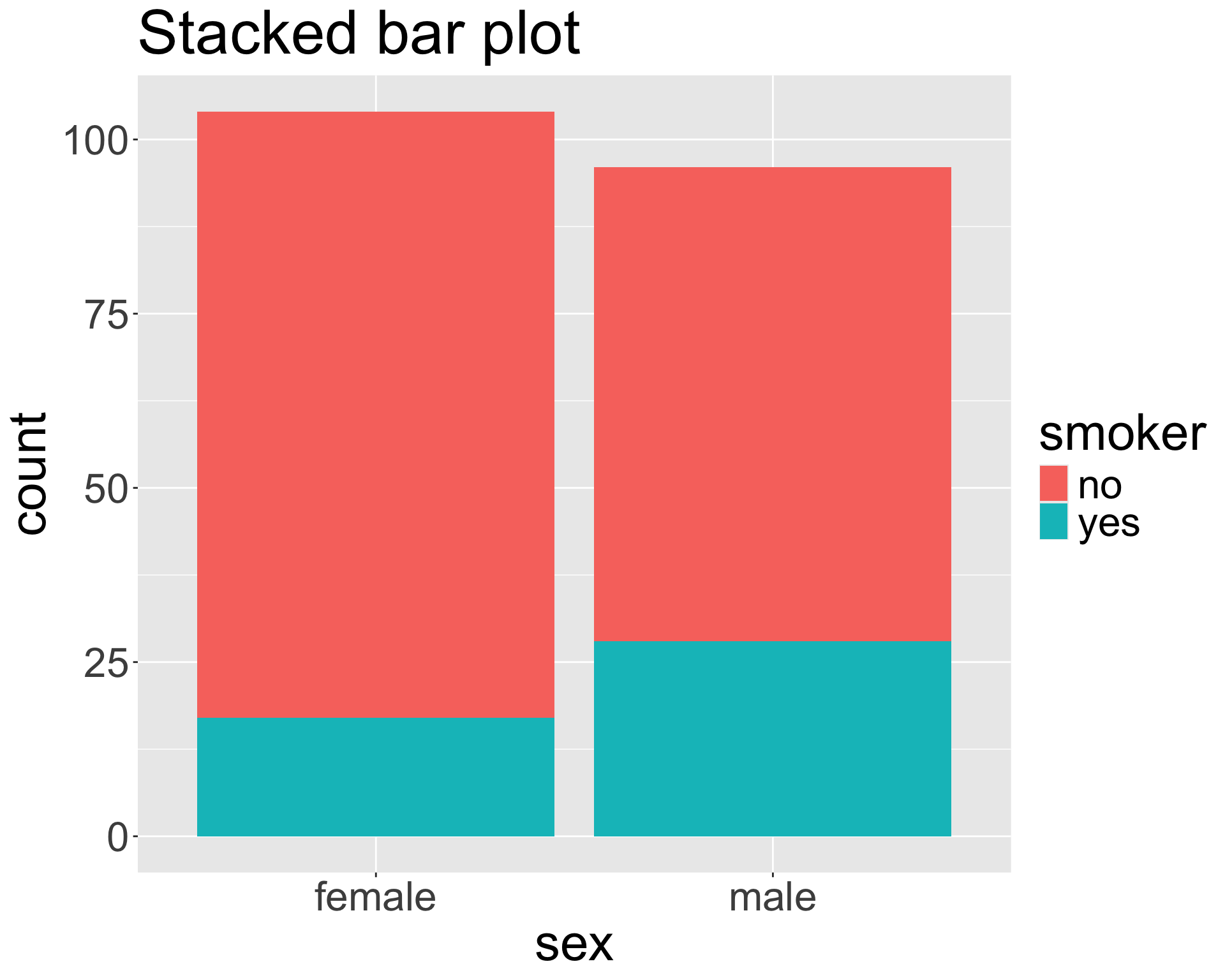
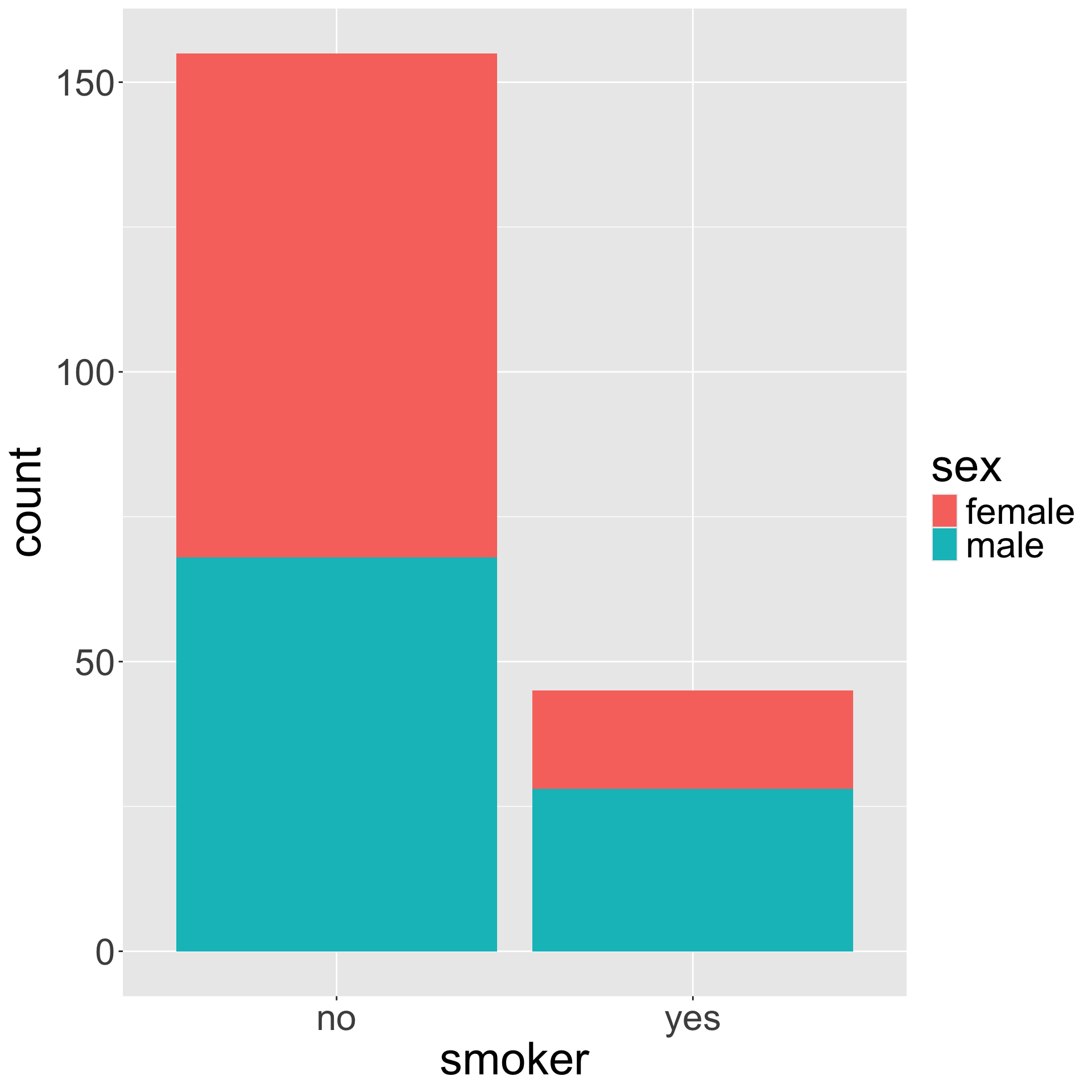
Stacked bar plot
The stacked bar plot looks at the counts either row-wise or column-wise.
Contingency table
| no |
87 |
68 |
| yes |
17 |
28 |
Proportions
Can convert the contingency table to proportions row-wise or column-wise to obtain the fractional breakdown of one variable in another.
Contingency table
| no |
87 |
68 |
| yes |
17 |
28 |
Row-wise proportions
| no |
0.561 |
0.439 |
| yes |
0.378 |
0.622 |
- What does the quantity 0.378 represent?
- If we take the proportions row-wise, does each row need to sum to 1?
- If we take the proportions row-wise, does each column need to sum to 1?
Proportions (cont.)
Set up how to find the column-wise proportions using our contingency table
Contingency table
| no |
87 |
68 |
| yes |
17 |
28 |
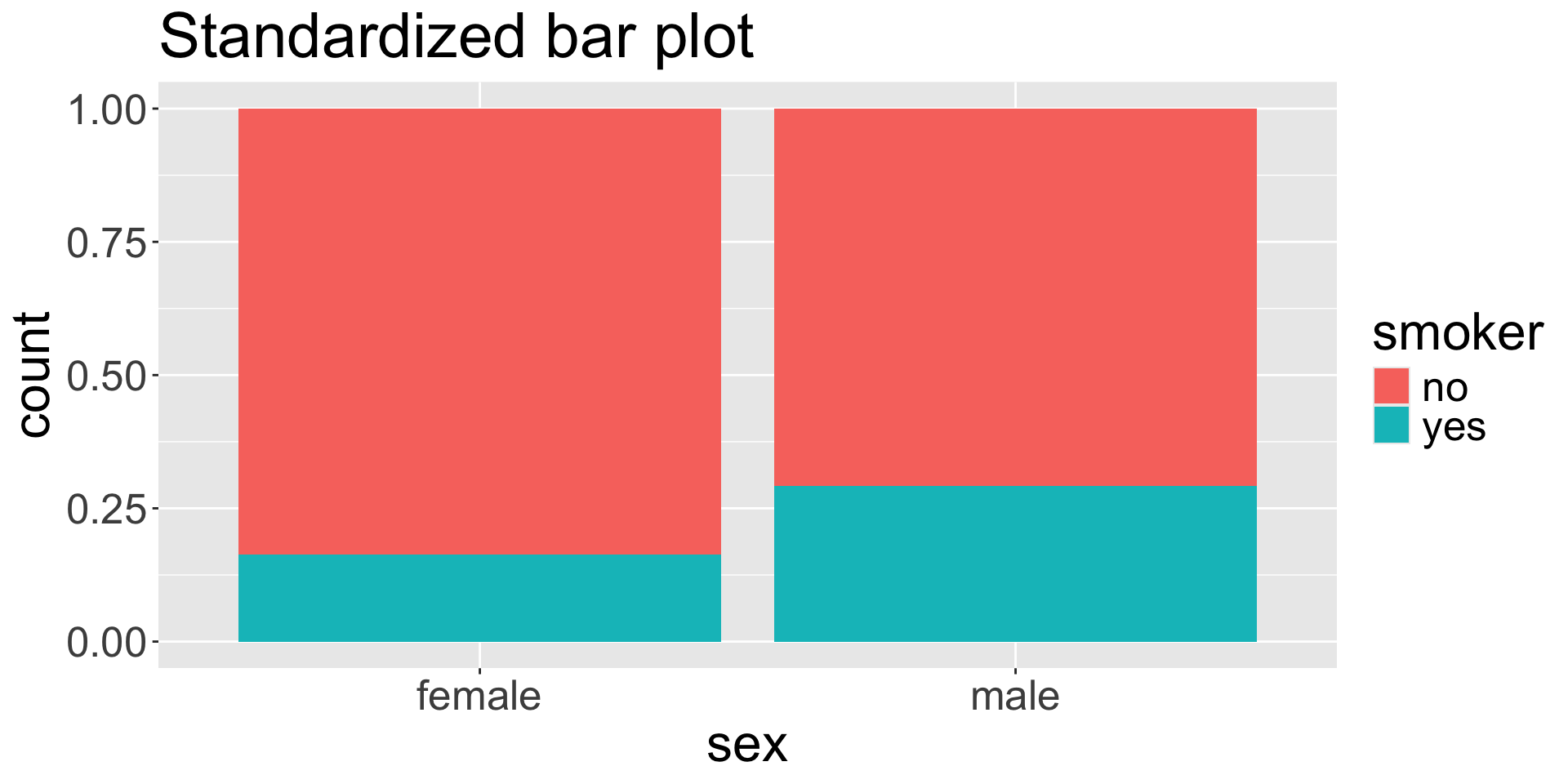
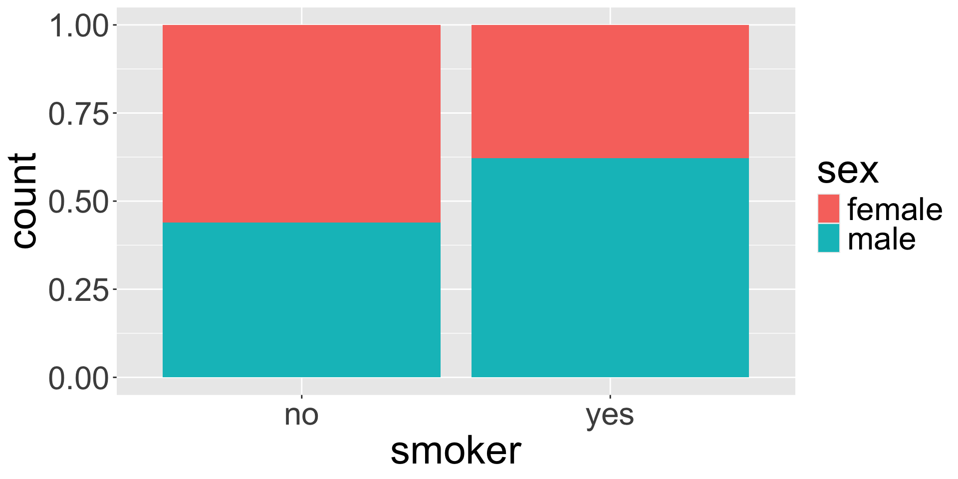
Standardized bar plot
The standardized bar plot visualizes these row-wise or column-wise proportions.
![]()
Choosing a bar plot
![]()
- Using any of the plots, do you believe the smoker status and sex are associated?
- When might you prefer to use the stacked, dodged, or standardized bar plot?
Live code
- Bar plots
- Aesthetics: fill, shape
- Faceting
- Plot background
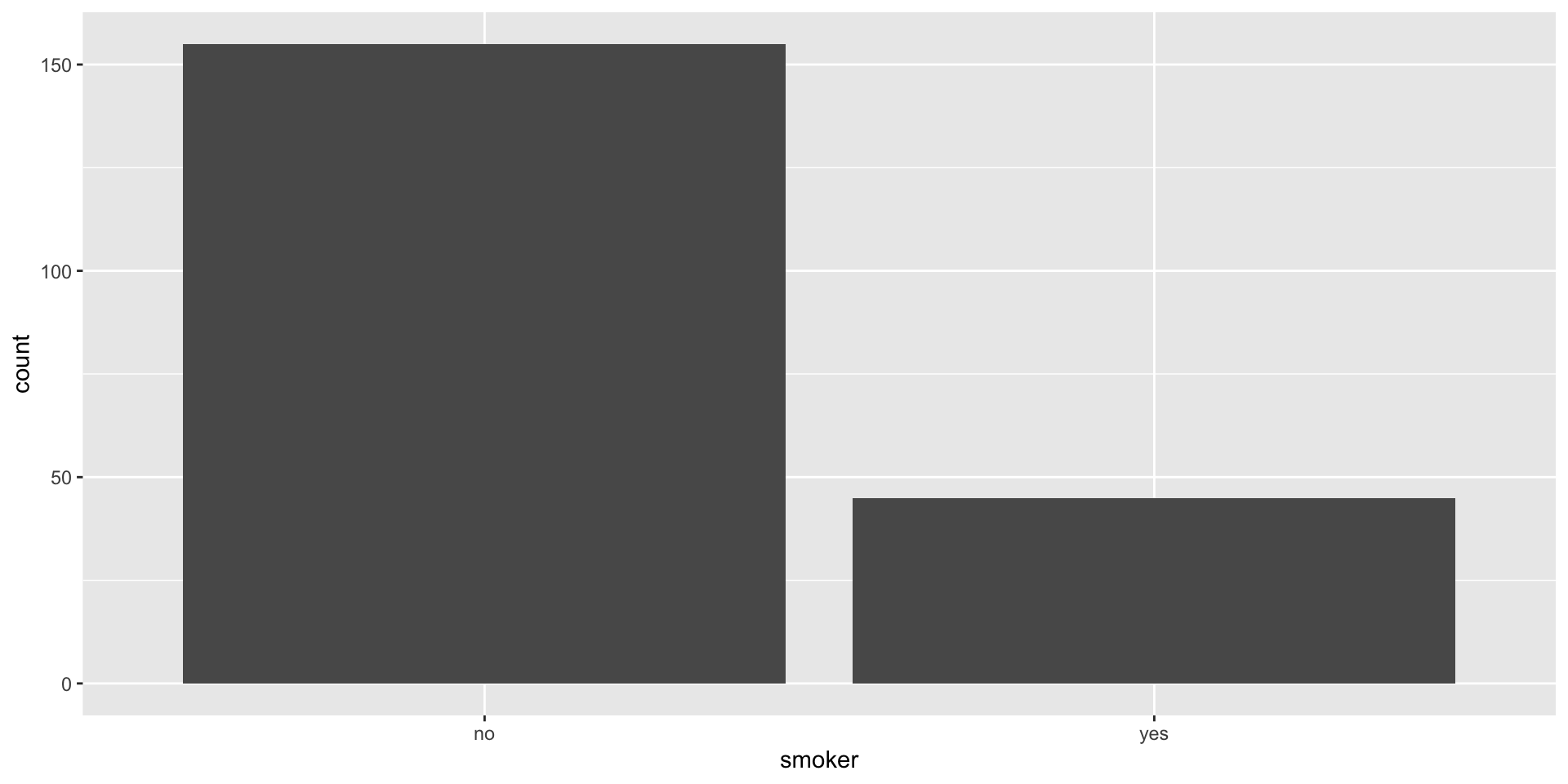
Bar plot (univariate)
ggplot(data = insurance, mapping = aes(x = smoker)) +
  geom_bar()
![]()
Note: if your data are already in the form of frequency table, we should use geom_col() instead!
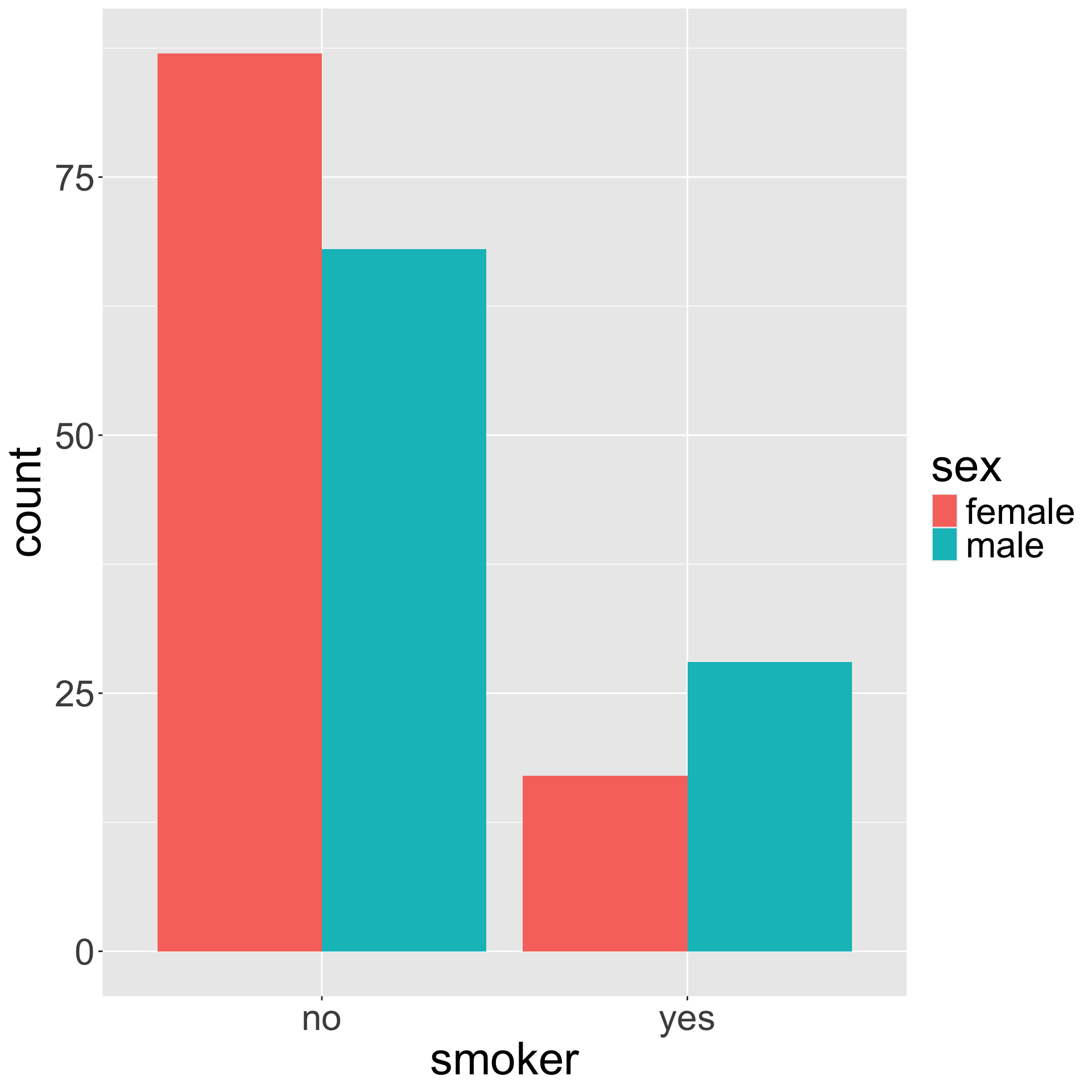
Bivariate bar plots
ggplot(insurance, aes(x = smoker, fill = sex)) +
  geom_bar(position = "dodge")
ggplot(insurance, aes(x = smoker, fill = sex)) +
  geom_bar(position = "stack") # this is default
Bivariate bar plots (cont.)
ggplot(insurance, aes(x = smoker, fill = sex)) +
  geom_bar(position = "fill")
![]()
How might we make the bars horizontal instead of vertical?
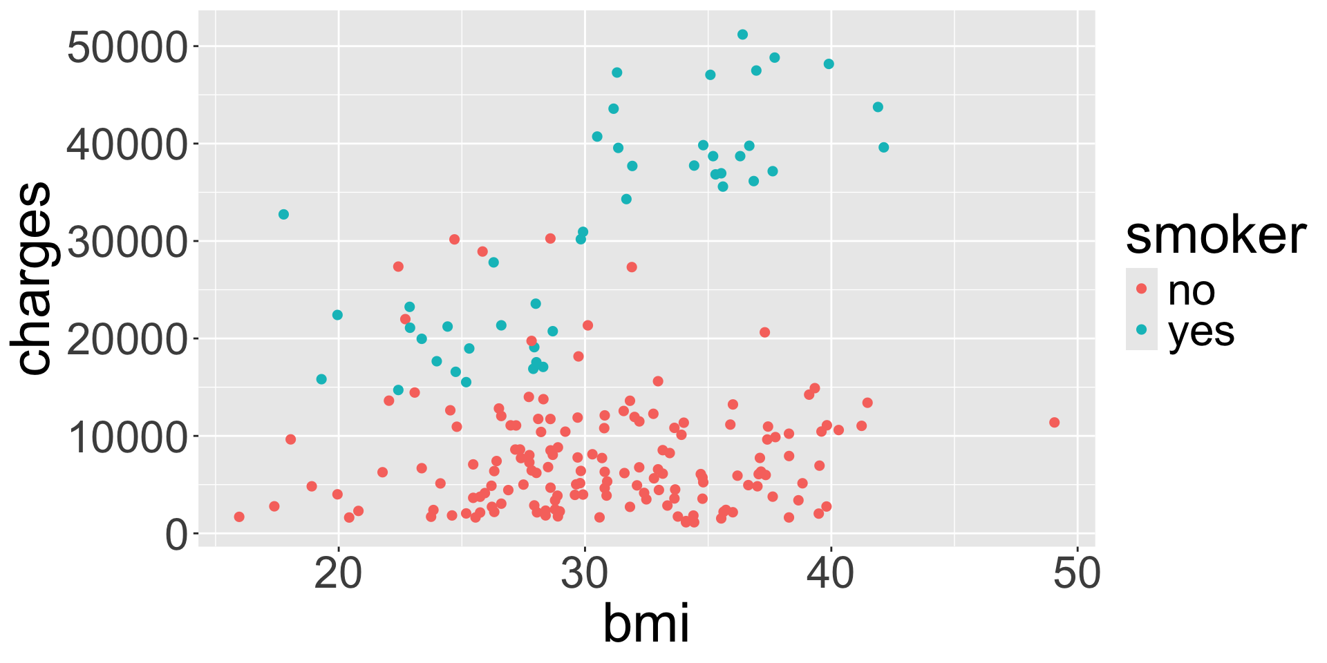
Visualizing numerical and categorical
ggplot(data = insurance, mapping = aes(x = bmi, y = charges, col = smoker)) +
  geom_point()
![]()
What do you notice about the legend for color compared to the legend for color from last week?
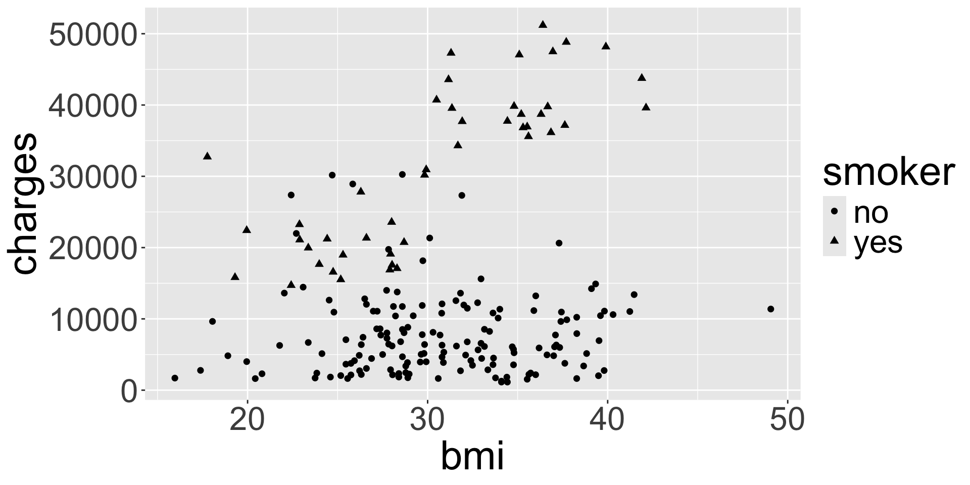
Aesthetic: shape
ggplot(data = insurance, mapping = aes(x = bmi, y = charges, shape = smoker)) +
  geom_point()
![]()
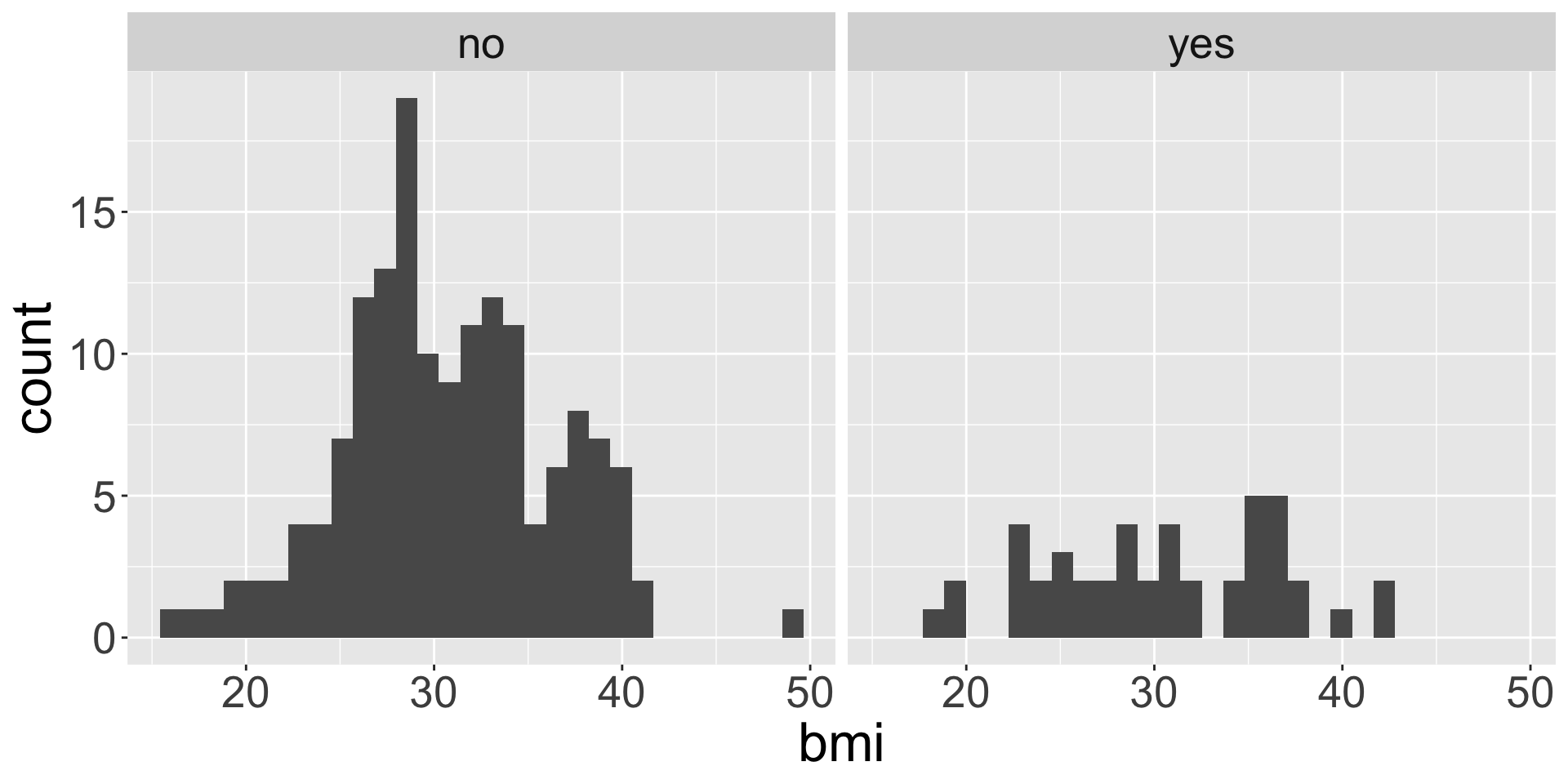
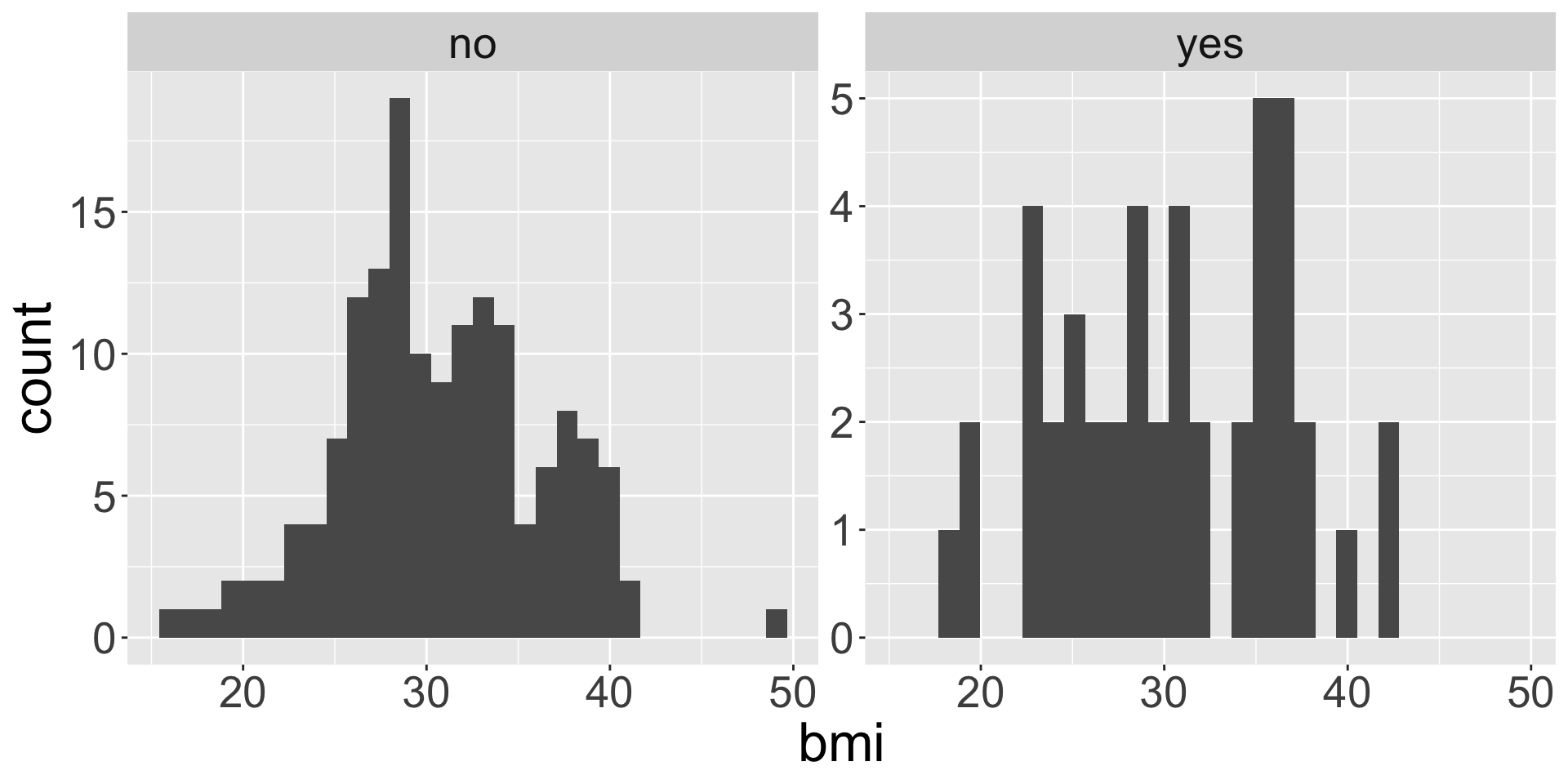
facet_wrap()
Faceting is used when we want to split a particular visualization by the values of another (categorical) variable
ggplot(data = insurance,
       mapping = aes(x = bmi)) +
  geom_histogram() +
  facet_wrap(~ smoker)
ggplot(data = insurance,
       mapping = aes(x = bmi)) +
  geom_histogram() +
  facet_wrap(~ smoker, scales = "free_y")
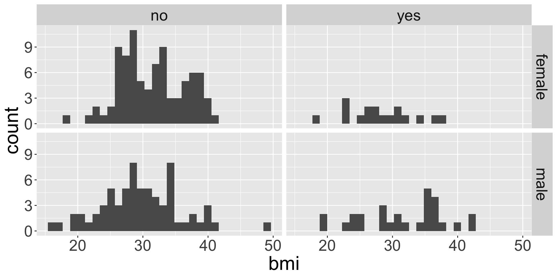
facet_grid()
ggplot(data = insurance, mapping = aes(x = bmi)) +
  geom_histogram() +
  facet_grid(sex ~ smoker)
![]()
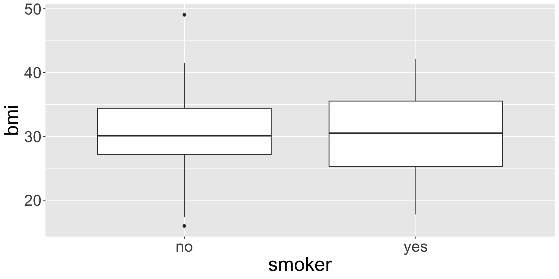
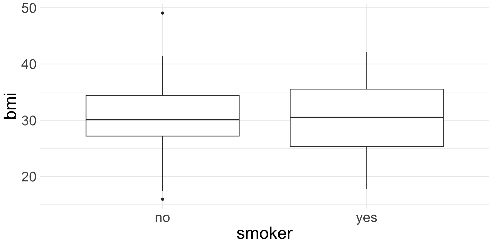
Side-by-side box plots
ggplot(data = insurance,
       mapping = aes(x = smoker, y = bmi)) +
  geom_boxplot()
![]()
Like faceting, but only for box plots. Really good for comparing a numerical variable across across a categorical!
Changing plot theme
Change the background of plots by adding on any one of the following:
theme_bw(), theme_minimal(), theme_gray(), theme_void() and a few more (see all options by checking the help file for any one of these)
ggplot(data = insurance,
       mapping = aes(x = smoker, y = bmi)) +
  geom_boxplot() +
  theme_minimal()